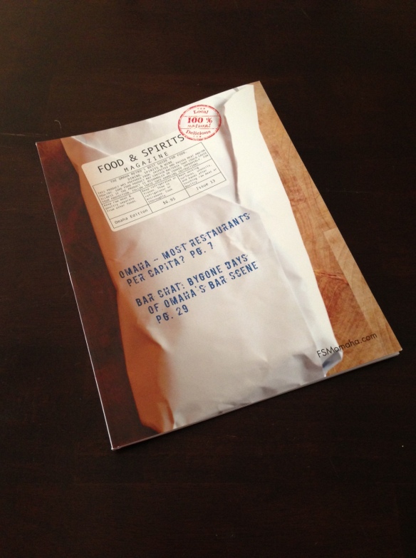
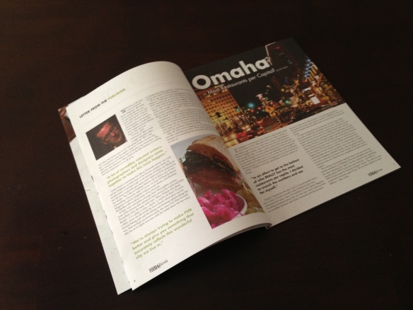
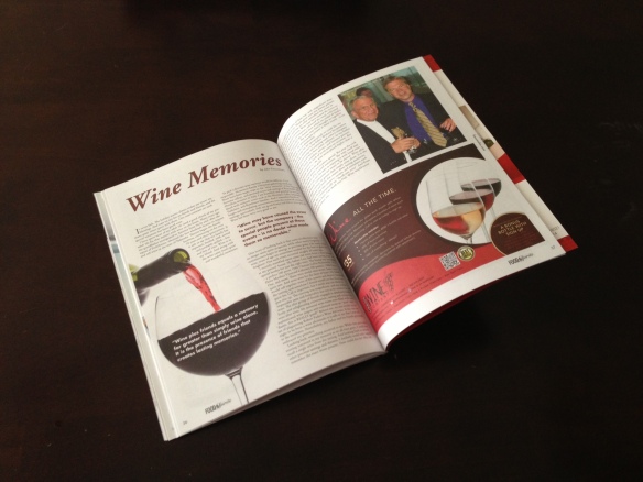
In February, I worked with Erik Totten, publisher of Omaha’s Food & Spirits Magazine on the design of their 13th issue. For going on five years, FSM has provided Omahans with some of the best food, spirits and industry-related articles, and this 13th issue is no different. All articles are contributed by local experts while photographers serve up juicy photography. For the latest on Omaha’s growing food & spirits scene, pick up a copy for yourself the next time you’re dining out.
Tag Archives: magazine
Newsweek Going Fully Digital in 2013

After 80 years in print, Newsweek recently announced it will cease all print publications at the end of this year. Newsweek will consolidate all of its existing publications into a single, worldwide edition named Newsweek Global, targeting a mobile audience.
“Exiting print is an extremely difficult moment for all of us,” says the company’s statement. “But as we head for the 80th anniversary of Newsweek next year we must sustain the journalism that gives the magazine its purpose—and embrace the all-digital future.”
While the publication’s print sales declined nearly 10 percent in the past year, its digital presence has seen significant growth. TheDailyBeast.com now attracts over 15 million unique visitors a month. With data from a recent Pew Research Study indicating that nearly 40 percent of Americans get their news from an online source and mobile device & tablet use growing exponentially, Newsweek felt the time was right for the transition to an all-digital format.
“In our judgment, we have reached a tipping point at which we can most efficiently and effectively reach our readers in all-digital format. This was not the case just two years ago. It will increasingly be the case in the years ahead,” (Baba Shetty, CEO).
The last print edition of Newsweek will be their December 31 issue.
Source: A Turn of the Page for Newsweek
Food & Spirits Magazine No.11 Design
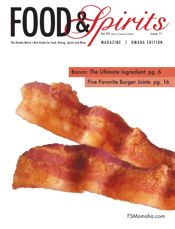
Scott Creative recently worked with Food & Spirits Magazine to wrap up the magazine’s 11th issue. Putting together a magazine may seem like a daunting task considering all the preparation, planning and attention to detail that’s involved, but working with FSM has always been a rewarding experience.
The challenges of magazine layout are numerous: working within the restraints of a final page count, collecting editorial and photos, making image and text work together to create interesting page layouts – just to name a few. In the end though, it’s tough to beat the smell of a freshly pressed magazine – not to mention the pride all those involved in the process feel after seeing it for the first time.
I’m proud of this most recent issue of FSM and it has plenty to offer readers. Aside from a healthy dose of local food, spirits and industry-related news, readers will find several interesting articles covering a wide range of topics. Look for your free copy at your favorite bar or restaurant in the Omaha Metro area this April.
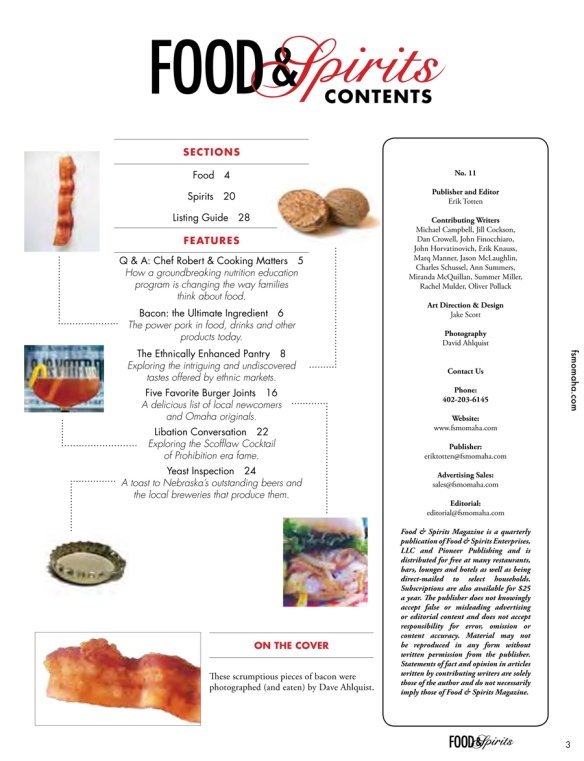

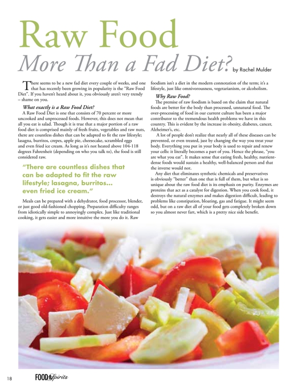
Food & Spirits Magazine

The tenth issue of Food & Spirits marks the sixth consecutive issue that Scott Creative has worked with the magazine.
For all of its locally driven content and creation, Food & Spirits Magazine (Omaha, NE) is without a doubt one of Omaha’s best resources for food, spirits, dining and industry-related news. I’ve worked with Erik, the publisher of Food & Spirits, on several issues of this publication. Time and time again, the in-depth discussions about goals and deadlines, the consequent hours of design, and the inevitable shuffling of the layout before press results in a final product that all contributors are proud to be a part of.
In the midst of the tenth issue of the magazine, Food & Spirits partnered with Pioneer Publishing, another well-known, locally owned publisher (home of the Reader). From the onset, Erik intended Scott Creative to be included as an ongoing contributor to the magazine and I’m fortunate to have the opportunity to continue working with them through this new partnership. This tenth issue is the culmination of what I believe is not only a sample of my best publication design to date, but also highlights the work of some fantastic local photographers and superb editorial from knowledgeable, local industry professionals.
If you live in the Omaha metro area, getting your hands on a copy is relatively easy. You can find the magazine in many bars & restaurants in Omaha – downtown in particular. Copies/subscriptions are also available here.


Branding for Blunts: How would Ad Agencies Brand Marijuana?

Proposition 19, the recent initiative to legalize marijuana for the masses in California may have failed, but that’s not stopping ad agencies, firms and potential future growers of the “cash crop” from thinking about how to brand pot should it ever make its way onto convenience store shelves.
Just what might a carton of joints look like? How magazine advertisements try to persuade you to buy one brand of pot over another? Newsweek recently asked two of New York’s most well-established ad agencies, Pentagram and Mother, to show their take on what pot branding might look like in the future. Package designs, billboards, print ads, even images of an iPad weed recipe app are all available for your viewing pleasure in a slide show on Newsweek’s site, presenting us with some interesting –and humorous – ideas on how pot products might be branded across various mediums.

Northern Lights, a pot brand developed by Pentagram, takes its name and design inspiration from the effects of a well-known, award-winning strain of marijuana. The brand’s mascot, Onehit the Wonder Moose and his smoky breath, representative of the Aurora Borealis (aka the Northern Lights) adorns packages billboards and magazine ads that focus on the lighter, more humorous side of marijuana use.

Mother shares a similar vein as Pentagram in its approach to pot branding, but with a very different look and feel to their designs. Mother’s Finest, is a pot brand composed of various blends similar to tobacco products by Marlboro or Camel, with each blend having its own unique appeal. With branding reminiscent of art and design of the 60s, psychedelic patterns and heavy serif fonts are used throughout environmental displays, packaging and signage. Color is also used as a signifier of the mood that each blend is best suited to.
“We imagined ‘Mother’s Finest’ to be the Marlboro of weed and established an occasion based marketing and packaging approach to give consumers the exact high they were looking for based on the activities of their particular day” (Mother New York).


